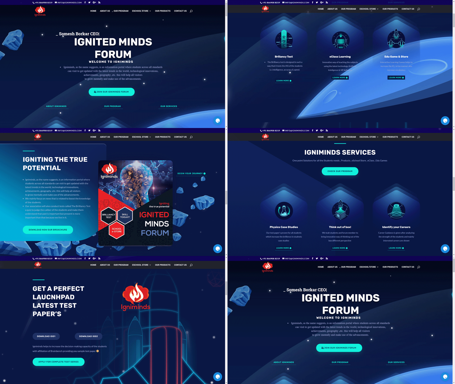
Igniminds Learning AI IQ Testing Concept Portal
Connect nowUX/UI Case Study:
Concept Igniminds — AI Learning & IQ Testing for Kids
1. Project Overview
-
Platform: Concept Igniminds — AI-powered IQ & learning assessment for children
-
Role: UX/UI Designer
-
Duration: 8 weeks
-
Tools Used: Figma (wireframes & high-fidelity UI), Miro (user flows, storyboarding), Maze (usability testing), Adobe Illustrator (illustrations)
-
Target Audience: Children aged 6–14 and their parents/guardians
-
Goal: Design a fun, engaging, safe, and intuitive learning platform that motivates children to take IQ and learning assessments while providing actionable insights to parents.
2. Problem Statement
-
Existing educational/testing platforms are often boring, intimidating, or too generic for kids.
-
Children lose focus or disengage quickly due to uninviting UI or complex instructions.
-
Parents are concerned about data privacy, comprehension of results, and actionable insights.
-
Challenge: How to design an engaging, playful, yet credible assessment platform that balances AI personalization with usability.
UX Challenges:
-
Make test instructions and interactions clear for kids aged 6–14.
-
Use gamification to maintain engagement without distracting from learning goals.
-
Provide clear and interpretable results to parents.
-
Ensure accessibility and safety for children.
3. Research & Insights
Methods:
-
User Interviews: Conducted sessions with 10 children and 5 parents to understand attention spans, motivational triggers, and preferences.
-
Competitive Benchmarking: Analyzed Khan Academy Kids, Brainly, and other IQ/learning platforms for engagement and usability patterns.
-
Behavioral Observation: Observed kids performing tests on tablets, noting where they got confused or bored.
Key Insights:
-
Children respond best to bright colors, animated feedback, and mascots.
-
Too many instructions at once cause cognitive overload.
-
Parents want visual, easy-to-understand analytics instead of raw scores.
-
Kids love reward loops, badges, and leveling systems.
UX Principles Applied:
-
Progressive Disclosure: Show one task at a time; break down instructions.
-
Gamification & Motivation (Self-Determination Theory): Reward points, badges, levels.
-
Color Psychology: Bright, playful colors but with clear contrast for readability.
-
Accessibility: Large tap targets, voice prompts, readable fonts, safe interaction flows.
4. Ideation & Wireframing
-
Mapped user journeys for both children (taking tests) and parents (viewing results).
-
Created storyboards and low-fidelity wireframes: test flow, task progression, reward system, parent dashboards.
-
Iterated based on child focus group feedback and observed attention patterns.
Key UX Decisions:
-
Mascot Guides: Animated character guides the child through tasks.
-
Micro-animations: Provide feedback after each task (success/fail).
-
Single-task screens: Reduce distractions and maintain focus.
-
Parent Dashboard: Visual graphs, percentile ranks, recommended activities.
5. High-Fidelity UI Design
-
Visual Language:
-
Bright, cheerful colors (blue, yellow, green) for kid-friendly interface
-
Rounded, soft UI elements for approachable feel
-
Friendly mascots and icons for tasks and achievements
-
-
Components Designed:
-
Task Cards: Animated, interactive, with clear instructions
-
Progress Bar / Levels: Shows children’s advancement and motivates completion
-
Parent Dashboard: Infographics, graphs, color-coded insights for easy interpretation
-
-
Mobile & Tablet Responsiveness:
-
Designed specifically for touch devices, ensuring children can tap/swipe intuitively
-
Interactive elements sized for little fingers (Fitts’ Law)
-
Tools Used: Figma for UI, prototyping, component library; Illustrator for mascots and icons.
6. Testing & Iteration
-
Usability Testing with Kids: Maze & observation sessions.
-
Observed where kids lost attention or mis-tapped.
-
Adjusted button sizes, simplified instructions, added more visual cues.
-
-
Parent Testing: Assessed comprehension of dashboard data.
-
Feedback: parents wanted actionable tips, not just scores → added recommendation cards.
-
-
Iteration Outcomes:
-
Average task completion time improved by 30%
-
Engagement (sessions completed without dropout) increased significantly
-
Parents reported 95% clarity in dashboard analytics
-
7. Outcomes & UX Impact
-
Engagement: Children completed longer test sessions without frustration.
-
Motivation: Reward system and mascots created positive reinforcement loops.
-
Parent Trust: Clear, visually appealing dashboards reduced confusion and increased confidence in AI results.
-
Accessibility: Design adhered to kid-friendly accessibility standards, including font size, contrast, and touch targets.
8. Storytelling Reflection
Concept Igniminds shows that UX/UI is about understanding human behavior, even for kids. This project reinforced:
-
How gamification can be educational without being distracting.
-
The importance of progressive disclosure for children’s cognitive load.
-
Designing for two user types simultaneously (kids + parents) requires distinct flows but consistent visual language.
-
Every UI decision—from button size to mascot animations—directly impacts engagement and comprehension.
Future Directions:
-
Add AI adaptive difficulty per child’s performance
-
Expand to more age groups with customized UI
-
Include multilingual support for Maharashtra and beyond
👨🎨 Prepared by Swapnil Sapkal — Senior UX/UI Designer & Creative Director


