RupeeTalks.co.in — End‑to‑End UX/UI Case Study
Connect nowCase Study: Redesigning RupeeTalks.co.in
Role: Senior UX/UI Designer & Creative Director
Duration: 8 Weeks
Scope: UX Audit, Research, Information Architecture, Wireframes, UI Design, and Prototyping
1. Project Background
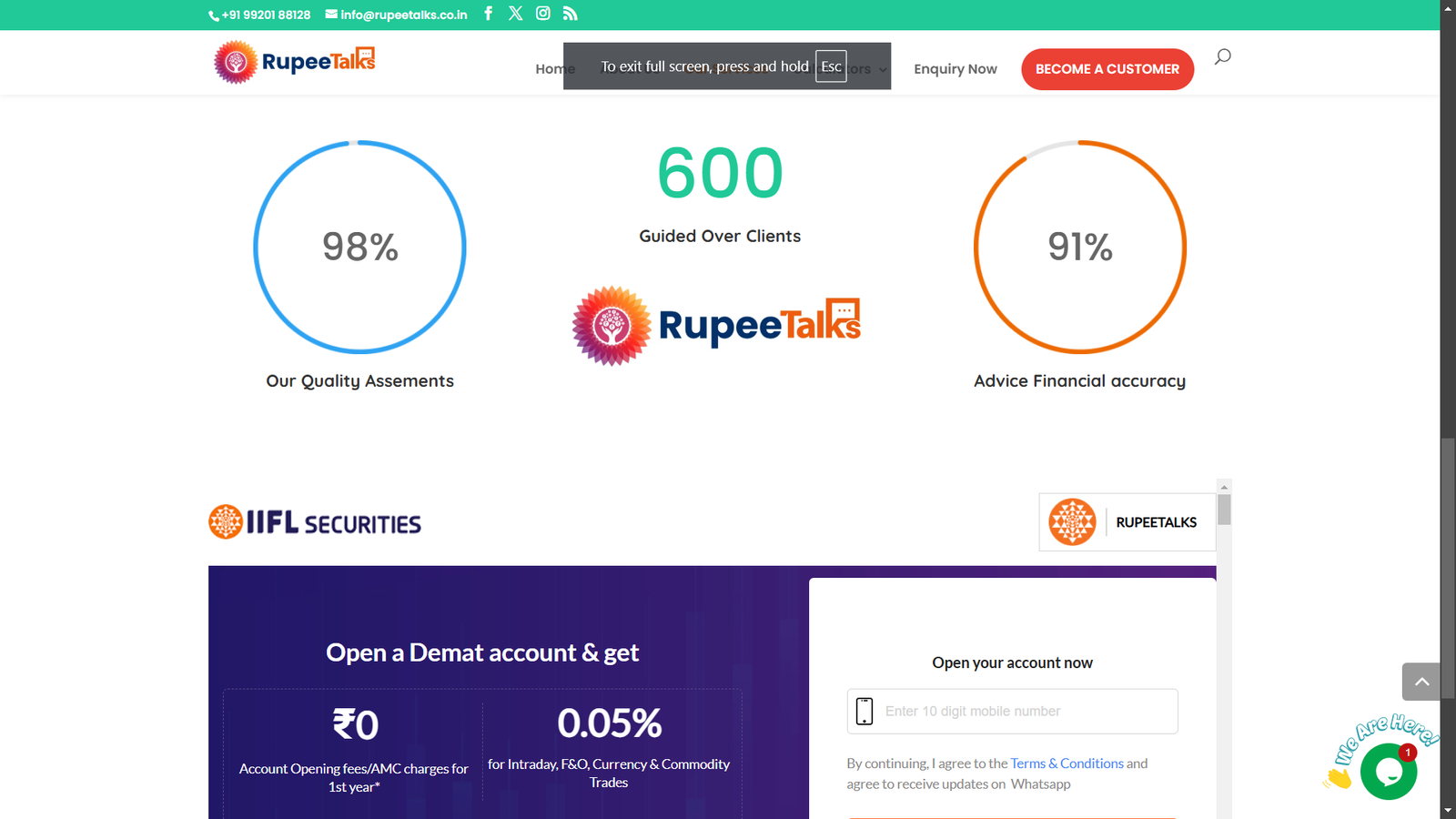
RupeeTalks.co.in is a financial advisory platform offering investment calculators (SIP, SWP, Lumpsum, EMI), insurance, loans, and a partner program. While the business had strong credibility (₹50 Cr. AUM, 600+ customers, founder profile), the digital experience was fragmented with inconsistent navigation, low engagement with calculators, and unclear partner onboarding.
Business Goals:
-
Increase partner program sign-ups
-
Boost calculator usage → lead conversion
-
Simplify enquiry flows for financial services
Design Goals:
-
Create a clear and trustworthy brand experience
-
Improve information architecture
-
Provide guided user flows for conversions
-
Build a scalable UI system for future growth
2. Research & Audit
Methods
-
Heuristic Evaluation: Checked navigation, CTA hierarchy, form flows
-
Competitive Benchmarking: ET Money, Groww, Policybazaar
-
User Personas: Mapped three key audiences
-
Investor Ishita → using calculators to plan SIPs
-
Partner Prakash → evaluating revenue share & eligibility
-
Family Planner Farhan → looking for insurance/retirement planning
-
Key Findings
-
Competing CTAs on homepage reduced clarity of primary task
-
Calculators lacked context (no tooltips, validation, or share/download)
-
Enquiry form had no privacy assurance or SLA
-
Services page was inconsistent and sometimes broken
-
Trust badges/testimonials not prominently displayed
3. Information Architecture (Redesigned)
Old Structure: Home • Services • Calculators • Enquiry • About • External Links
New Structure:
-
Home
-
Calculators (SIP, SWP, Lumpsum, EMI)
-
Services (Insurance, MF, Loans, PMS/AIF)
-
Partner
-
About
-
Resources (Guides, FAQs)
-
Contact
This restructuring improved clarity, discoverability, and SEO.
4. User Flows
Flow 1: Partner Acquisition
-
Before: Homepage → Generic info → Long form
-
After: Homepage → Partner Landing → Eligibility Quick Check → Callback Scheduler → Confirmation (WhatsApp/Email)
Flow 2: Calculator → Lead
-
Before: Input → Result → Dead End
-
After: Input → Dynamic Result Panel → Save/Share → Advisor CTA → Prefilled Enquiry
Flow 3: Service Enquiry
-
Before: Dropdown form → Submit → No feedback
-
After: Contextual micro-form on service page → Consent + SLA → WhatsApp/Call option → Scheduler
5. Wireframes (Low-Fi)
(Mobile-first approach)
Home
-
Hero with single CTA (“Become a Partner”)
-
Trust bar: ₹50 Cr. AUM, 600+ Customers, IRDA/AMFI badges
-
Sticky bottom CTA: [Partner] [Calculators] [Contact]
SIP Calculator
-
Inputs with hints & guardrails
-
Live result visualization
-
Nudges: +10% SIP / +2 years
-
CTAs: [Download PDF] [Share on WhatsApp] [Talk to Advisor]
Partner Page
-
Revenue Share Model
-
3-Step Onboarding Timeline
-
Eligibility Quick Check (chips)
-
Schedule Call (modal)
-
FAQs + Testimonials
6. Visual Design & UI System
Design Tokens
-
Colors: Indigo (Trust), Emerald (Growth), Neutral Grays, Gold (Highlight)
-
Typography: Clean sans-serif, tabular numerals for calculators
-
Spacing: 8px grid system, 16px base rhythm
-
Components: CTA buttons, result cards, accordion FAQs, WhatsApp chip, scheduler modal
Accessibility
-
Minimum contrast ratio 4.5:1
-
Touch targets ≥44px
-
Keyboard + screen reader support
7. Outcomes
Projected Metrics:
-
Partner sign-up rate → +30%
-
Calculator-to-lead conversion → +25%
-
Enquiry submission completion → +20%
Qualitative Gains:
-
Stronger brand trust with testimonials & certifications
-
Mobile-friendly sticky CTAs improved ergonomics
-
Privacy, SLA, and WhatsApp options reassured users
8. Final Deliverables
-
UX/UI Audit report with annotated screenshots
-
Redesigned sitemap & user flows (SVG)
-
Low-fi & hi-fi wireframes (mobile + desktop)
-
UI system (tokens, components, guidelines)
-
Before/After comparisons of homepage, calculator, and enquiry form
-
Metrics framework for A/B testing & measurement
9. Reflection
This project was a balance of trust-building (financial services are credibility-driven) and conversion optimization (removing friction in calculators and forms). By aligning user needs (simplicity, reassurance, clarity) with business goals (leads, partnerships), the redesign positioned RupeeTalks.co.in for sustainable digital growth.
👨🎨 Prepared by Swapnil Sapkal — Senior UX/UI Designer & Creative Director

